What Goes Above the Fold?

Dr. Sue Polinsky

Screen Real Estate
Location. Location. Location.
Know what loads on a monitor, tablet or mobile device. That’s your prime screen real estate.
Preview What Loads First
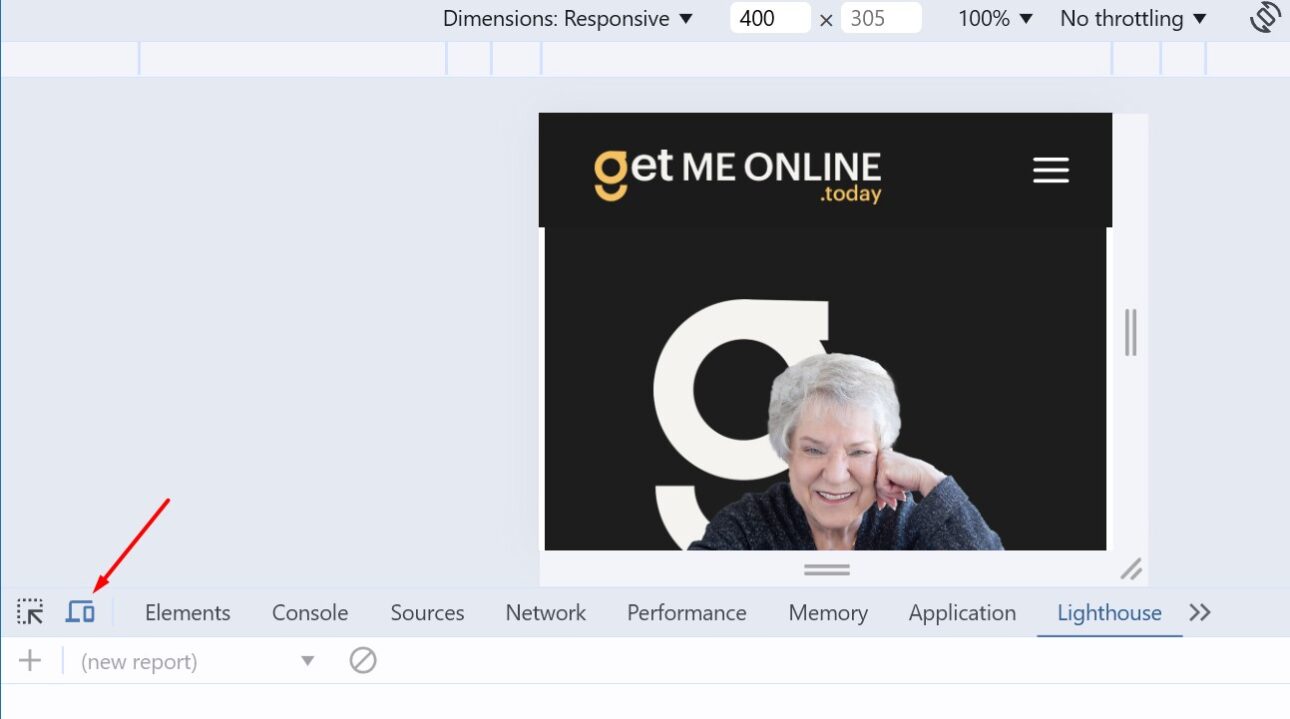
If You Use Chrome
Using Chrome – Press 12 and then click the screen icon
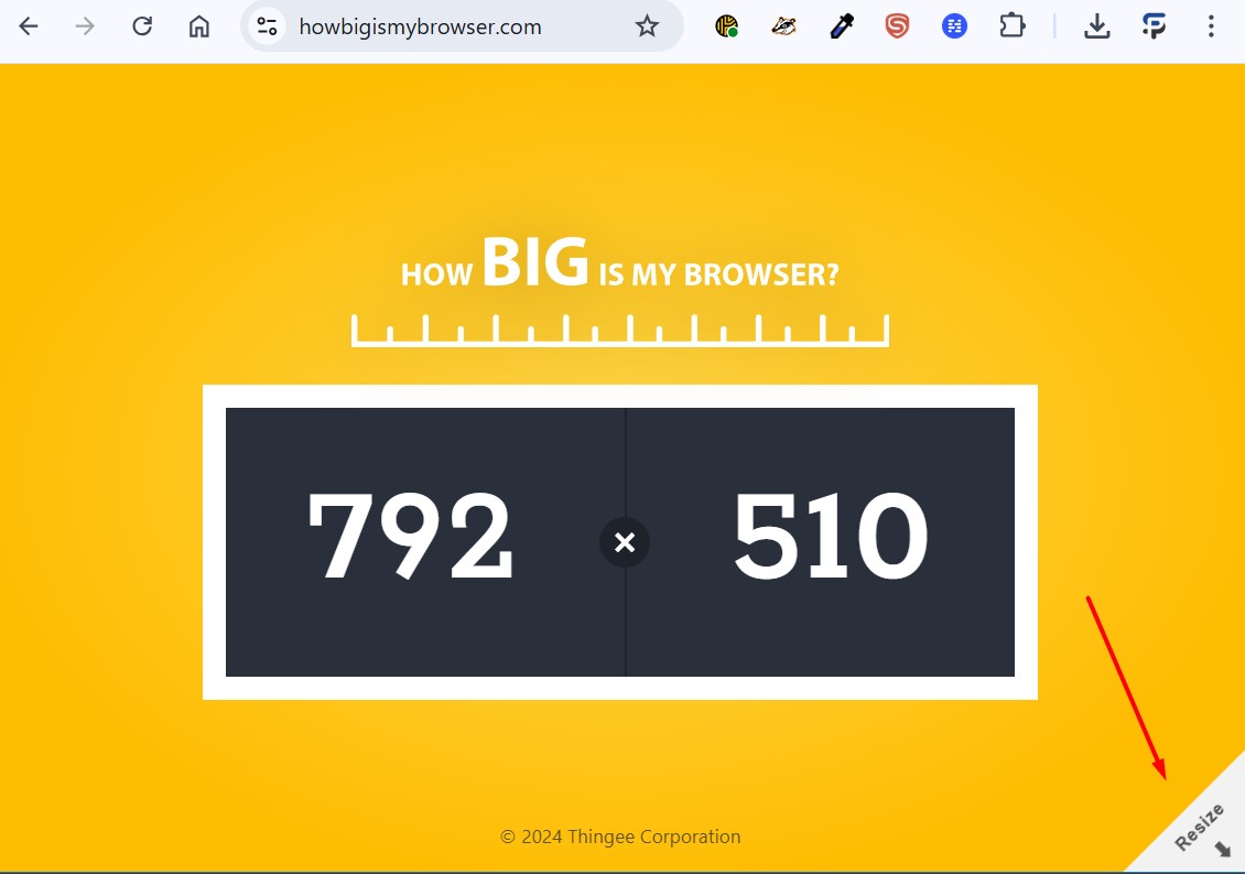
How Big is Your Browser?
How People Read Homepages
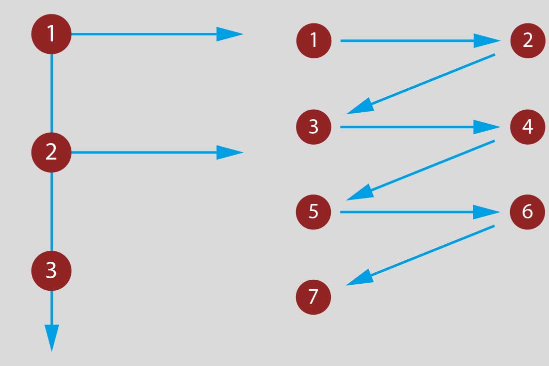
People USED to read webpages like the letter E or F.
Now they read a webpage like a Z.
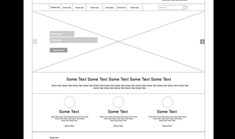
Don’t Waste the Hero Space
Wasted Space

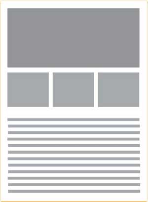
What Structure Belongs in the Hero Area?
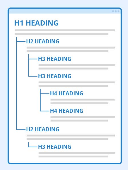
Use Headings Correctly for SEO and Accessibility
- Most WordPress themes set H1 as the page title.
- SEO experts believe you should use only one H1 tag on a page. There is some disagreement about that and we’ll discuss it in a moment.
- Use an H2 tag next, add some content (paragraphs).
- The next tag should be an H3, add content.
- At this point, depending on the content, you can add an H2, lather, rinse repeat.
What Makes a Hero Space that Sells?
1. Who you are.
Don’t add your mission statement and information that mostly belongs on the About page. Tell visitors that you are a firm / individual that does “this thing” or makes “this product” and why they want to buy it.
2. What you do or sell.
Use accurate images of your product or service. It’s way past time to buy photos at many stock photo houses. Make the clients look like your clients.
3. How they can buy it.
For products, the homepage should have categories of what you sell above the fold.
For services, give visitors an action item in the hero area in addition to “book a call.”
Sue’s Rule: Make it easy for people to buy what you’re selling!
Do You Have an Example?

What Makes a Good Call to Action Above the Fold?
A good call to action (CTA) in the hero space is clear, concise, action-oriented, and conveys a clear value proposition to the user, prompting them to take a specific action by using persuasive language and creating a sense of urgency when needed; it should be easily visible, well-placed in the hero with white space, and designed to stand out visually while aligning with the overall website aesthetic.
Your job is to:
CTAs Encourage Visitors to:
Home Page Features
Clean, easy-to-navigate layout, clear visual hierarchy, compelling content, a strong call-to-action, high-quality images, responsive design, and a consistent brand aesthetic.
- Logo and branding
- Navigation Menu
- Hero Image (up for discussion)
- Call to Action
- Relevant Content
- Social Proof
- Responsive Design
- Testimonial/Review
Visual Hierarchy
Use a hierarchy and choose elements that work together
and don’t fight for attention.
SCALE

CONTRAST

DIRECTION

POSITION
Putting it All Together
Five principles of website homepage design
- Ensure everyone has easy access to the homepage.
- Use implicit links (logos) and explicit (“home” link).
- Make it recognizable.
- Communicate clearly who you are and what you do.
- Your homepage is your elevator pitch.
- Put your logo on the left – that’s where visitors look for it.
- Include your tagline.
- Use images that accurately reflect your brand.
- Reveal content through examples.
- Put examples above the fold.
- Guide users to scroll down (anchor links).
- Prompt actions and navigation.
- Where links go should be clear (“high information scent”).
- Avoid “Read more” and “Learn more” links.
- Make it easy for people to buy what you’re selling.
- Use simple, standard, recognizable design.
- Visitors are used to certain layouts; where things are.
- Minimize motion and animation (depends on your product).
- Make it load fast.
Questions and Contact